Pythagora.ai

Every designer knows that moment when a tool promises to revolutionize your workflow, then leaves you staring at a blank screen, wondering how to make it actually useful. That’s exactly what’s happening with AI right now. Artificial Intelligence is no longer a distant sci-fi promise — it’s already in our Figjam boards and Figma files. And while tools like ChatGPT or Claude can feel magical at first, they quickly expose a frustrating truth: If you don’t know how to talk to AI, it won’t know how to help you.
As a designer, I know the excitement and tension that comes with this. Suddenly, we’re expected to be writers, strategists, and prompt engineers — on top of everything else.
But here’s the good news: prompting is design. And design is communication. It’s something we already do every day. For example, think back to the last time you gave design feedback:
“Make the color of the UI more accessible for older users.”
“The button size is too small for the thumb interaction.”
“Give the user contextual error messages.”
These are prompts — they work for AI too. That realization changed everything for me, but it took a real project to truly understand what “prompting” actually means in practice.
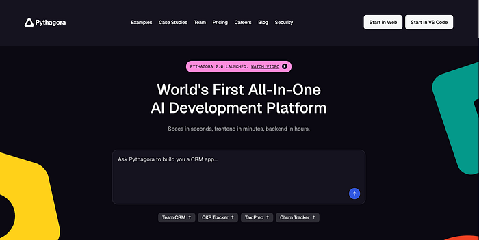
As a designer, I was handed a new kind of brief: Design prompts for a product being built entirely on Pythagora, a no-code AI platform that helps teams build applications without traditional coding.
Pythagora.ai
I’ll be honest — I had no idea what I was doing. Prompting? Sure, I’d used ChatGPT for quick ideas. But designing prompts for actual product behavior? That was new territory. Exciting, yes. But also… nerve-wracking.
In traditional design, we start with low-stakes wireframes. We expect to revise. There’s always ⌘ + Z. But in prompt design? Every word counts. In production environments where API calls cost tokens, there’s pressure to optimize prompts efficiently.
That fear was real. What if I wrote the wrong thing? What if the AI misunderstood me? What if the developers set everything up, and I break it?
That’s when I started exploring standard AI prompt types to see how they might apply to my design challenge:
You give the AI a task with no example — just the instruction. “Summarize this usability report in three bullet points.”
Great for tasks like rewriting or summarizing, but results can feel generic or misaligned with brand tone.
You give one example to guide the AI. “Here’s our marketing tagline: ‘Bringing startup agility to Enterprises.’ Now write one tagline for our sub-brand.”
Better control over tone and format, but still not enough context for complex tasks like journey mapping.
You give multiple examples to ‘train’ the AI in the prompt. You share 2–3 copy examples from previous projects and then ask the AI to generate more in the same style.
Good for replicating content patterns, but can become bloated and doesn’t adapt well to UX complexity.
You give the AI very clear instructions, almost like micro-copy for a form. “Write five onboarding screen messages, each under 12 words, written in a friendly and reassuring tone.”
Great when tasks are specific and constraints are clear, but struggles with open-ended design problems that require empathy or context.
You show the AI how to think through a problem step-by-step. “First review the designs. Then list all the UI improvements. Then give 3 suggestions.”
Powerful for reasoning-based tasks, but not intuitive for visual thinking or design systems logic.
Having knowledge of these prompt types was just the beginning. The real question was: Which one would work for designing actual product behavior?
As I tried applying each type to my Pythagora project, I hit a wall. Here’s why: These prompt techniques work well for specific design tasks like copywriting, but when applied to holistic design challenges — the kind I was facing — they miss the mark. The tools are strong, but the framing doesn’t account for how designers actually think and work.
So what now? I went back to my design roots. What if I treated prompt design like any other design challenge? In product design, we create design systems — foundations, components, patterns. So we tried the same approach for our Pythagora prompts.
We created:
Foundations: Defined brand tone, product principles, design language
User flows: Mapped out journey-based prompts (e.g., “Create a new OKR”, “Set progress”)
Variants: Tried modular prompts for different screen states
But it didn’t work. The AI lost track with too much context, didn’t read the Foundation guidelines well, and missed most of the variants.
We pivoted to:
Focused context: We gave it minimal, relevant context instead of comprehensive documentation
Clear hierarchy: We used Markdown to organize sections and highlight priorities
Frequent refresh: We refreshed the thread often instead of overloading it with information
The result? Much better. The AI stayed on track, maintained tone consistency, and delivered more relevant outputs. Our revision cycles dropped from 5–7 iterations to 2–3, and consistency scores improved noticeably. Learn more about the project here.
This experience taught me something fundamental: AI doesn’t fit into traditional design processes — you have to adapt the process for AI. The role of a designer is shifting — not away from creativity, but toward orchestration.
Most prompting advice comes from developers and writers. It doesn’t account for how designers actually think and work. That’s why we need frameworks that acknowledge ambiguity, embrace iteration, blend visuals and language, and work with creative constraints.
This led me to explore frameworks like CARE and Perfect formula, adapting them specifically for design challenges.
CARE is a structure that works especially well for research, writing, and generating UX-focused ideas. Unlike developer-focused frameworks, CARE accounts for the contextual thinking designers use daily.
Context — Provides the background or scenario. Who is this for? What’s the situation?
Action — Specifies the task. What do you want AI to do?
Results — Articulates the desired outcome. What should the output look like?
Examples — Shows the desired response format.
Example: “You’re designing an onboarding screen for a mental wellness app targeted at Gen Z (Context). Create a 3-step onboarding flow (Action) with microcopy in a calming, friendly tone. Output in bullet format (Results). For example: (Examples)
Step 1 — Welcome message
Step 2 — Set your intention
Step 3 — Daily reminder setup”
CARE worked well for straightforward design tasks, but I found it wasn’t robust enough for complex, multi-layered design challenges. That’s when Perfect formula became valuable.
Some tasks in design are layered and contextual — like writing onboarding flows or outlining product strategy. Perfect formula is a more comprehensive structure for complex design thinking.
Task — Your instruction to the AI, what you want it to do
Context — The situation, background, or constraints
Exemplars — Examples that illustrate the expected structure, format, or tone
Persona — Who you want the AI to “become” while generating the response
Format—How you want the information structured
Tone — The emotional style or attitude of the output
Simple Example First: “Write three button labels for a checkout flow (Task). This is for an e-commerce app where users often abandon cart at payment (Context). Use action-oriented, confidence-building language like ‘Secure Checkout’ instead of ‘Pay Now’ (Exemplars). Act as a UX writer specializing in conversion optimization (Persona). Provide them as a bulleted list with brief rationale for each (Format). Professional but reassuring tone (Tone).”
Complex Example: “Create user research interview questions for usability testing (Task). We’re testing a new expense tracking app for freelancers. The app launched 2 weeks ago and we’re seeing 60% drop-off after signup. We need to understand why users aren’t completing their first expense entry (Context). Follow this structure: ‘When you first opened the app, what was your initial impression?’ (open-ended observation) → ‘Can you walk me through how you would add your first expense?’ (task-based) (Exemplars). Act as a senior UX researcher with 5+ years of experience in fintech user testing (Persona). Provide 8 questions in a numbered list, with 2–3 follow-up probes for each main question (Format). Professional but conversational, avoiding jargon, designed to make interviewees feel comfortable sharing honest feedback (Tone).”
Ready to try this approach? Here’s how to begin:
Start small: Pick one routine design task (like writing error messages or button labels) and try the CARE method
Document what works: Keep a running note of prompts that produce good results
Build your template library: Create reusable PERFECT templates for common design challenges
Share with your team: Test these frameworks with colleagues and refine based on feedback
Iterate regularly: Like any design process, prompt design improves with practice and feedback
The truth is, we’re still in the early days of prompt design. With every passing week, AI tools are getting faster, more intuitive, and more embedded in our design workflows.
Just like design systems evolved from style guides… Prompt design will evolve too.
The methods we use today — CARE, Perfect formula, zero-shot, chain-of-thought — will transform. We’ll co-create with AI, not just command it. We’ll build prompt libraries that are as flexible and nuanced as our Figma components. We’ll develop team-wide prompting practices, design principles for AI interaction, and brand voice guidelines for AI outputs.
And most importantly, designers will lead this evolution, not just adapt to it.
Because design isn’t just about how something looks or works — it’s about how it understands and responds to people. And that’s exactly what prompt engineering is becoming: a conversation, a collaboration, a craft.
Happy prompting!